As we start the spring, 2017 semester, I thought it appropriate to discuss browsers a bit. Many students know that I recommend testing web pages they create in multiple browsers. This includes desktop as well as mobile browsers. Why? Because different browsers use different rendering engines. This means pages may look great in one browser and less than perfect in another (this is why I always include some obvious errors in this weblog – it will render differently in various browsers). Yes, I included these errors on purpose. And… you never know which browser a visitor will be using when they visit a page you have created. Of course, as we begin 2017, one rendering engine has captured the majority of market share – Blink (which is used by the Chrome browser). However, that is 63%; meaning someone might be using one of the many other choices (the remaining 37%).
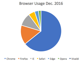
Here is a pie chart of usage of the major desktop browsers as of Dec. 2016. Chrome has 63%, Firefox has 15%, Internet Explorer has 10% and Safari has 5% (the rest are less). These values come from StatCounter.
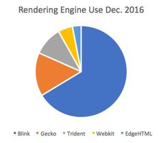
Rendering engines used by these browsers are as follows:
- Chrome – Blink
- Firefox – Gecko
- Internet Explorer – Trident
- Safari – Webkit
- Edge – EdgeHTML
- Opera – Blink
- Vivaldi – Blink
So if we just look at rendering engines, we see that Blink has the market share (but not all). For those who are curious, Blink is a fork of Webkit.
Of course, most browsers implement their own enhancements on top of the rendering engine. If you really want to see what happens when you request a web page in a browser, I recommend “how browsers work.”
So, I would test any page I create in at least Chrome, Firefox, Internet Explorer and Safari. That is just on the desktop; mobile should definitely be considered (and may be another post in the future).
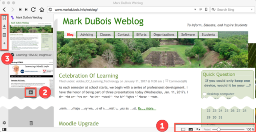
You may note that I mentioned a browser you may not have heard of in the above list (Vivaldi). Although it only accounts for less than 1% of market penetration at this point (and uses the Blink rendering engine), one should keep aware of developments. This is why I use Vivaldi from time to time. If you have never experienced this browser, I provide a screen capture below. You will note some numbers associated with the screen capture.
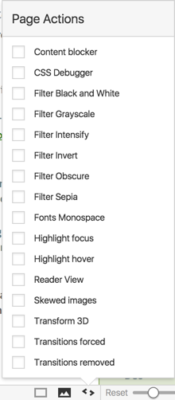
In the lower right of the screen [1], you see that you can easily size the page (default is 100%). For people like me with poor vision, it is easy to quickly zoom in and then reset. Yes, others browsers allow you to do this as well, but few show you the amount of zoom. One can also easily take various actions on the page (denoted by the < and > symbols).
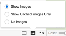
One can also easily hide images (this is always a nice feature when testing a page for accessibility).
Lastly, if you have multiple tabs selected, you can tile them easily.
I like all these features and find them very useful.
You can also easily open a new tab in the browser interface [2] in the browser image above.
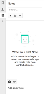
And you can work with bookmarks and much more [3] in the browser image above. I particularly like the ability to record notes about specific pages (including screen captures).
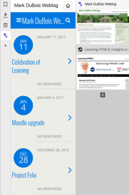
I also like the ability to create Web Panels (think smaller versions of pages). In the example, you will note this displays as the mobile friendly version of a site. You can toggle the visibility of these as well.
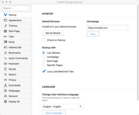
Of course, there are many settings you can control (such as themes and much more).
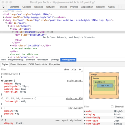
And, you have the typical developer tools you would expect in any Blink implementation.
The reason I mention browsers (like Vivaldi) is to encourage you to see what some are doing in terms of the browser interface itself. Of course, I would be remiss if I didn’t mention another Blink based browser (which seems to push the boundaries even further) – Opera Neon.
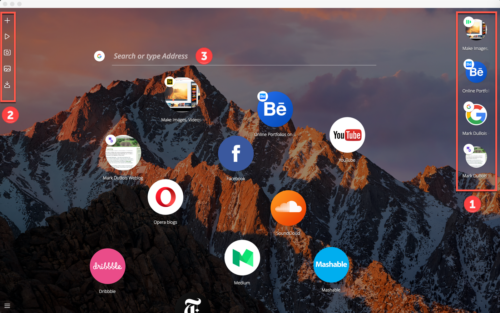
For those not familiar, here is a screen capture of what that browser interface looks like.
Let’s examine the numbered areas in the above screen capture (note the desktop background shows through by default). [1] represents your open tabs (or bubbles in this case).
[2] allows you to quickly take screen captures (using the camera icon) which are saved in your gallery.
[3] allows you to search (which will open a new tab/ bubble).
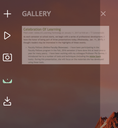
The gallery itself looks like the following. Yes, I only included one screen capture at the moment.
I hope that you are now inspired to check out some alternative browsers. Both Vivaldi and Neon use the Blink rendering engine. However, there does seem to be some innovation starting anew with various browsers. I am curious which other browsers you would add to the above list? Perhaps Brave? I am also curious as to your experiences after trying out some of these experimental browsers.
As the semester starts, let’s broaden our horizons and not just think in terms of testing in Chrome on the desktop. Sure, that accounts for 63% of the market; but Internet Explorer once accounted for 90% of the market. If there is sufficient interest, I may also discuss mobile options in a future post.
