Responsive design (where content is modified to display on a given device) is easy to discuss and sometimes difficult to implement. Not only should your text be positioned properly for various devices, but images and fonts should respond accordingly. The days of having a website which can be only viewed on a desktop are long over. Pinching and zooming on smaller screens is an impediment. We have media queries to help, but it can be difficult to deal with the myriad complexities associated with responsive design techniques. Enter Adobe Edge Reflow. Admittedly, this is a preliminary version (released in mid-February, 2013), and it only generates test code which works in the Chrome browser. That being said, it is worth further investigation. You can gain access to the product with a free Creative Cloud membership. A good starting point is the introductory article by Chris Griffith. Using that article as a starting point, I investigated this product myself.
Let’s examine the core problem with smaller screens. Consider the two screen captures below (same website). The first image is the site without any modifications. Note the incredibly small text size and the need to constantly scroll around the interface. Not the sort of user experience which will cause one to return to the site.
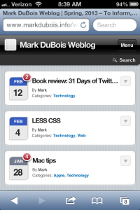
Next, consider the same site with a bit of mobile optimization (below). The interface better fits the device.
The above example was done with alternate technology (WPTouch plugin for WordPress), but you can clearly see the difference. Sadly, many websites today follow the former approach when viewed on a mobile device. Pinching and zooming should not even be an option, but it is the only choice for so many websites.
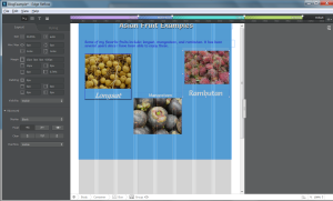
It looks like Edge Reflow is a tool which may be able to help (especially as it evolves over time). Let’s first look at the interface. Click on the image below to enlarge (then return to this page).
The first thing you will notice about the interface is that it is very visual (true of most Adobe products). Near the top is a color coded line indicating various sizes for different screens (such as phone, wide phone, tablet, desktop and so forth. I suspect the interface will change over time, but let’s get started. For those who are curious what the actual code generated looks like, I provide this link (best viewed in the Chrome browser at the moment).
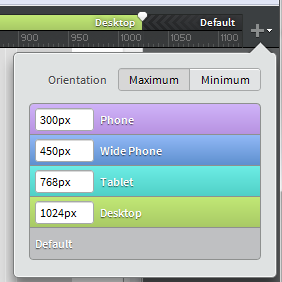
We first need to set our media queries (done by clicking the add icon on the upper right of the screen) and moving the resulting pin to the appropriate pixel width (see below).
You will note a series of chevrons in the resulting color coded query (see below). These indicate whether a minimum or maximum width is controlling the query. To resize the query, just move the pin left or right.
Once you have your media queries established, it is a good idea to name them. Click near the same icon you used to add a query (the downward pointing triangle) and assign names by double clicking the default values.
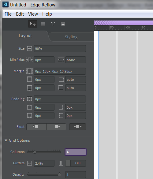
I know, I chose such clever names. Note that you can not change the colors (not really a big deal and this is a very early release of the product). If we examine the interface, we see that it is set to 12 columns for aligning items. This works great for default/ desktop work, but is overkill for smartphone sized workspaces. You can change the number of columns in the layout panel of the tool. Simply adjust to the desired size and modify the layout. In the screen capture below, I have set the number of bacground columns for the smartphone size to 4 (highlighted).
As with many Adobe products, the panels are highly dependent on the object. Therefore, it is always a good idea to select what you want (such as the overall background) before examining the layout panel in detail.
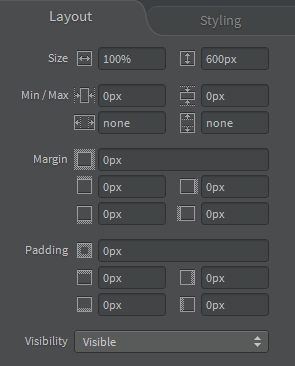
Now that I have a starting workspace (with the desired dimensions), I can begin development of a test page. I first used the rectangle tool to draw a box in the default view and then set the background color of the box. I used the layout panel to tweak the dimensions, margins and padding as desired. Yes, this is a demo and I will intentionally introduce some issues so readers can see the various effects.
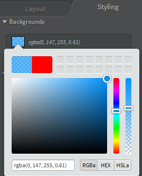
Examining the screen capture above, you can see the amount of control you have over various aspects of layout. I next added a desired color in the Styling panel (see below).
After working with this tool for a short while, I found that I was constantly switching between the layout and styling panels.
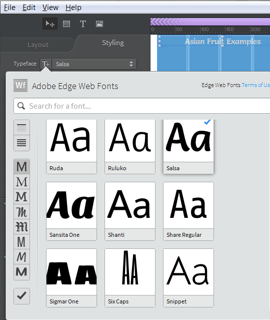
Next, in keeping with the concept of designing for mobile first when possible, I selected the phone sized screen and added some text (there is a text tool adjacent to the rectangle tool in Adobe Edge Reflow). After entering the initial text, I selected it and decided to choose a different font. One has access to a variety of fonts via the Adobe font library. Note the selection below. I can choose to display a subset of available fonts by clicking on the icons to the left of the panel. The check mark at the bottom will only display those fonts you have selected for the given project.
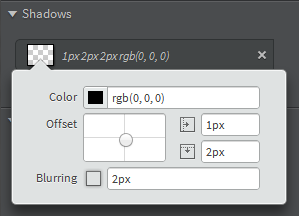
In this case, I chose the Salsa font as you can see with the check mark. One can also add CSS-3 enhancements such as shadows to the text. In the screen capture below, you can see the values I chose.
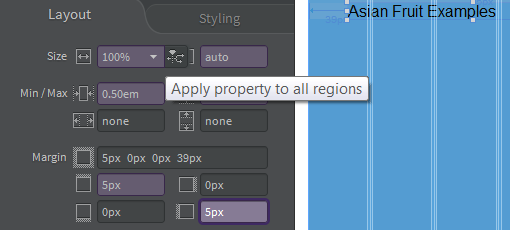
One feature which should be noticed is the ability to apply your chosen styles to all screen resolutions. I captured that in the image below.
I decided to add images and text and group them (Ctrl+G). One can also preview in the Chrome browser View > Preview in Chrome. I include a screen capture below with a resized Chrome browser to show the overall effect.
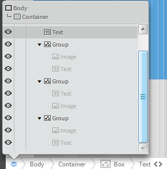
Lastly, there are some helpful inspection tools ar the very bottom of Adobe Edge Reflow. As with many of these tools, the options available depend on the object selected. In the example below, I have the top text selected. Firstis the DOM inspector (looks like stacked layers icon on the bottom of the tool).
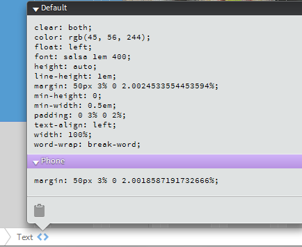
I can also click on the < > icon to see the associated CSS. Although one can not modify the CSS displayed, one could copy it to the clipboard for further analysis. Obviously, one can also use the developer tools within Chrome to further examine the resulting code.
Overall, I like the initially available version of Adobe Edge Reflow. It has some quirks, but is a great start to helping individuals understand responsive design. In the example I created, I purposely mis-aligned some items just to see how well the tool would handle them. Note that I set the visibility to hidden for the images on the smaller screen sizes. Their size adjusts as one moves to the larger (desktop) version. Here is the working example page I created (ok, I was hungry at the time). Those who wish to examine the native .rflw file (and the associated assets) can download my zip file as a starting point to experiment.
Personally, I think this is a great first version of the tool. I think it will definitely help students better understand what is involved in creating responsive web pages. Some initial improvements I would like to see in Adobe Edge Reflow include the following:
- The ability to directly export the HTML, CSS, JavaScript and so forth (by default, it is created in the assets folder). Presently you have to change the name manually (a save as feature would be great).
- The ability to directly interact with the code (for example in the CSS inspector). Not just the ability to copy to the clipboard, but to make minor tweaks (similar to what one can do with the Chrome developer tools (or Firebug in Firefox).
- Support for other modern browsers (at least the majority of WebKet based browsers).
I am curious what your initial impressions are of this tool? How do you plan to use it? As always, I welcome your comments. Of course, I have to manual approve them due to the volume of spam I receive. Positive or negative comments are approved as long as they are legitimate.
