I recently participated in a local WordPress meeting where Project Gutenberg was reviewed by Brandon Wickwire. For those who are unaware, this is likely the version of the editor (and much more) which will be coming with version 5.0 of WordPress. Brandon’s presentation inspired me to experiment a bit with the new interface. Here are some initial observations.
- It is ridiculously easy to test the new interface. Simply download the Project Gutenberg plugin, install it, and activate it. When you are finished testing, deactivate it.
- The editor interface is significantly different from the current interface (more on that in a bit).
- There is increased emphasis on accessibility (including obvious messages if you try to post a low contrast text/ background color combination).
- The editor is context sensitive and focused on blocks (think HTML divisions).
Let’s delve a bit deeper into the interface.
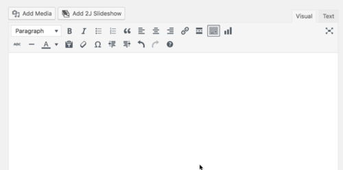
First, for reference purposes, here is what the current editor looks like in WordPress 4.9. For those who are curious, this interface is based on the open source TinyMCE editor.
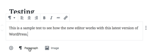
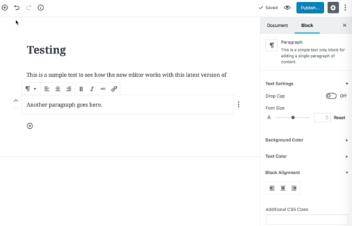
Here is what the editor looks like in Project Gutenberg.
 Yep, that is what you see. In many ways, it is similar to what you may encounter in interfaces such as LinkedIn Pulse. Personally, I like the interface; it is very clean and intuitive. That being said, if you have clients or students who are used to working with the current interface, you might want to take the time to train them and help them transition.
Within this editor, everything is considered a “block.” In theory, this will position WordPress to move well beyond the concept of a viewport. It should well position WordPress for the next decade (at least that is their purpose). The editor is very context sensitive. For example, when I add a bit of text, I am then able to “enhance” it. You see some similarities with the current editor (and it is very much a select, then perform an action sort of editor).
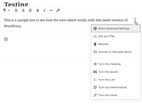
When you click on the three dots on the right, you have the ability to perform many of the tasks you are likely familiar with. I do like the concept of a “reusable block.” As I understand the concept, one can convert a bit of code and then use it on multiple posts/ pages. When one makes a change to the reusable block, the changes ripple through all instances. If you wanted to provide a bit of a bio for an author on multiple pages, this would be a great use.
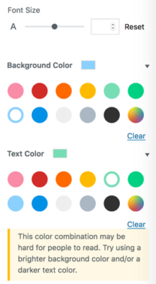
By default, there are more options for the document and for specific blocks. these are found on the far right side of the editor interface. If you examine the image below, you will note that you can set the foreground (text) and background colors of individual blocks. You can also easily create a drop cap for the start of a paragraph.
As mentioned, if you select low contrast color combinations, you are presented with a warning. The text and background colors I initially selected are represented by the white circles with the colored ring. Yes, it was a bad choice (on purpose).
Because all is context sensitive, you have the ability to add many “blocks” within the editor. Simply click on the plus icon on the interface and you see a number of choices. Some are shown in the screen capture below.
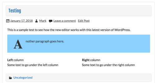
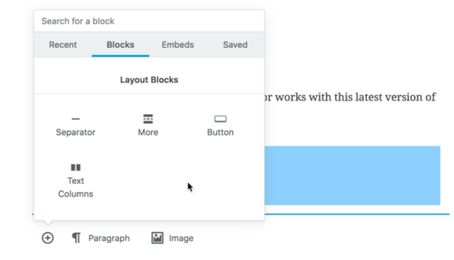 You will note that you can add text columns and much more. Once you begin experimenting with Gutenberg yourself, I encourage you to scroll through the many options. Of course, there is an eye icon (instead of the current Preview button) to preview the page. Did I mention there were many interface changes. Here is a simple example I created.
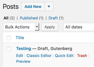
Since this is a plugin, you can deactivate it. Once you do, your pages appear as any other draft. When you reactivate it, you can pick up testing where you left off. With Gutenberg activated, you see the post draft as shown.
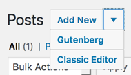
If you wish to add a new post, you can choose either Gutenberg or the Classic approach.
Since this is a plugin, I have no way of testing how this affects my other plugins (or themes or any modifications). The documentation does indicate that support for shortcodes will remain.
One of my over arching concerns is that there are many changes coming. In the past, it was a simple matter of just upgrading a site for a client. Given the magnitude of these changes, one may wish to think “long and hard” before upgrading a client site. As we discussed at the meeting, it is hoped that security updates continue for version 4.9 for some time and that the roll out is gradual.
I heartily recommend you experiment with this technology. It is coming. It is also only in beta. DO NOT INSTALL THIS ON ANY PRODUCTION WORDPRESS INSTALLATIONS. Yes, I was shouting. Also, when you finally decide to upgrade to 5.0 at some point in the future, make certain you have solid backups of your site at the 4.9 level (and have confirmed you can restore your site from said backups). You have now been informed.
I hope you found this overview useful and I look forward to your comments as always.


Very helpful article on the coming changes. I’m really anxious to see how current custom themes will be affected.