I recently purchased an Apple watch (series 2) to replace my aging Pebble watch (the eInk screen was starting to fade significantly). The watch was shipped directly from Suzhou (China). It was rather fun to watch it transit from Shanghai to Anchorage to Louisville and eventually to my home (taking all of 4 days). Now that I have had a couple of week’s experience with the watch, I thought it might be worthwhile to share my experiences with others. As best I can tell, it is best when paired with an iPhone (I have a 6S Plus).
One of the items I found most interesting is that there is a whole new vocabulary associated with this watch. For example:
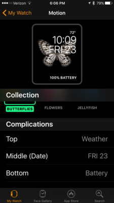
- Complications (I thought there were a “bad” thing). In terms of the watch, there are faces (just like my Pebble, but much fancier). When you add items to the watch face, these are called complications. For example, I wanted to add the battery life to my butterfly watch face (this is done in the lower part of the screen).
- Dock – when you press the side button, you are presented with a list of commonly used apps. Yes, you can configure this dock for the apps you use the most. I find this helpful as I generally avoid the “Skittles” view presented when pressing the digital crown (yes, another term).
- Digital Crown – this allows you to see the home screen or watch face.
- Side button – this allows you to see the dock (you can double click to use Apple Pay). You can also use this to turn off the watch or to make an emergency phone call (which you can also configure to send information to family/ friends).
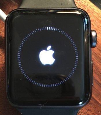
Ok, let’s look at the watch itself. Of course, the first thing I did when I received it was to update the OS (watchOS 3.1 is the current version). One needs to have the watch connected to the charger during an upgrade. The watch itself displays a screen while updating (see below).
As with my Pebble, most of the interface can be controlled through the use of the Apple Watch app (on the iPhone). FYI – there is no such app for the iPad (which sort of makes sense as most iPads must use wifi to connect to the Internet).
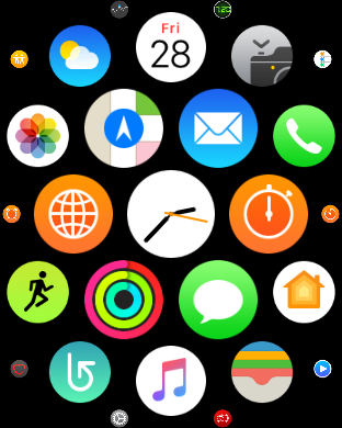
If you press the digital crown, you see the typical “Skittles” display. You can configure this by moving items around. The one in the center is the one that displays when you click the digital crown. You can also scroll (using the digital crown) to see more or fewer apps displaying. The smaller dots on the periphery indicate I have scrolled in a bit. While I found this feature interesting, I have found I almost never use this interface (I rely on the dock much more for daily activities).
One feature that I really like is the ability to do a screen capture directly while using the watch. Simply press both the side bar and digital crown at the same time and the watch face flashes indicating a screen capture has occurred. These are saved directly into the Photos app on your iPhone.
One of the features I like the most is the integration between the watch and my iPhone. For example, I can use the watch to take a photo using the camera app on my phone. Yes, this can be helpful because it is sometimes necessary to position the phone in a spot where it is not easy to see the screen. You see it using the watch interface.
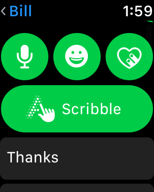
I like the messaging capabilities. One sees any SMS messages received and one can respond just using the watch. There are a number of canned replies you can scroll through (you can modify and add to this list). You can also use the watch microphone to dictate your response. Or, you can scribble individual characters (perhaps you are in a meeting and can’t readily reply). The messaging interface is shown below.
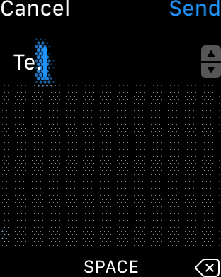
If you choose scribble, you are presented with an area where you draw each letter. You see this in the area of dots taking up the majority of the screen below. Even with my atrocious handwriting capabilities, it recognizes the majority of the letters I scribble.
As mentioned above, you can choose from a number of watch faces. Personally, I prefer the butterflies (I am an entomologist at heart after all). Most of the images shown are actual specimens. You can see how one configures the watch face in the screen capture below. This was taken from the app on my phone. As you see, one can also choose flowers or jellyfish. One indicates desired complications in the appropriate locations.
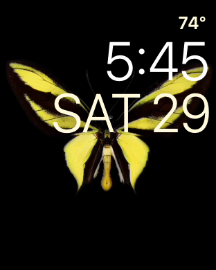
The end result is what appears on the watch when you tap the digital crown.
Yes, this is an actual species of butterfly (called a birdwing). They are found in southeast Asia and Australia. Note the temperature, time, and date also appear.
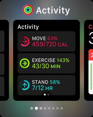
Depending on the watch face you select, you can have a large number of “complications.”
When you tap the sidebar, you see the dock. In this case, you can scroll through the apps you have placed in the dock.
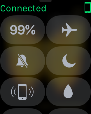
You can change watch faces by swiping from the left or right on the watch. You can swipe up to take various actions (such as turning on airplane mode). Items which are greyed out are “turned off.” You can also find your phone (it does help to have the phone in range of the watch or you will need to unlock it periodically).
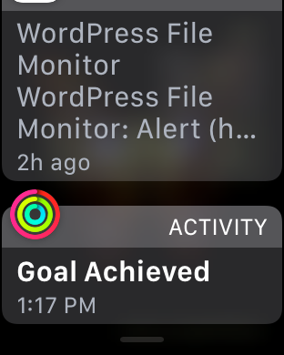
If you swipe from the top, you see the most recent messages (including email, Twitter, Facebook, and any other apps you have configured).
Overall, I like the watch. It is a bit pricey.
That being said, there are two things I would like to see improved.
- The haptic sensation seems low (compared with my original Pebble). Yes, I know you can adjust it and I have mine set as high as it will go.
- Apple Pay seems to work on a hit or miss basis (I have been finding I often need to use my phone instead). This may be due to the readers in local shops, I don’t know.
The battery life seems reasonable (lasting well over a day). I do like the fact that it appears to be fairly water resistant. There is even a feature to shake the water out of the watch if needed. The watch is comfortable and the interfaces are intuitive (after you get used to them). I did find a bit of a learning curve (for example, you must specifically configure the app to take screen captures).
If you have an Apple watch (or are considering getting one), I am curious as to your thoughts. I hope you found this quick overview helpful. As always, I look forward to your comments.
