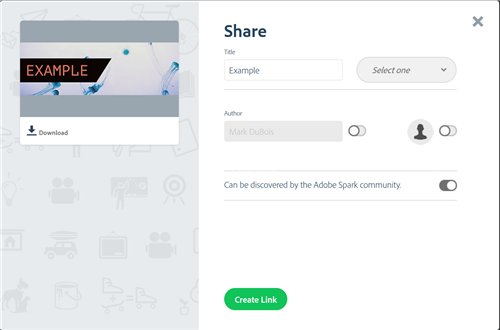
Adobe recently announced Spark. This is more than a “re-branding” of the iOS only apps Voice, Slate, and Post. The links in the previous sentence take you to my initial reviews of those iOS apps. The significance of Spark is that these apps are also now available via the web. You don’t need an iPad or iPhone – you can just use a modern browser. You merely visit Spark.Adobe.com and login with your Adobe ID (which you can create for free). You have the ability to share your work with others (and can download a copy to your computer). These are some of the options available. You should select a category and indicate whether your work can be discovered by the Spark community.
In my view of the world, this represents a significant improvement. Many students simply can’t afford an iPad or iPhone and these apps have tremendous possibilities to “jump start” student’s creative work. I suspect this is also true of many teachers. I see a significant potential in Spark for teaching and learning. Let’s investigate the web version of Spark in a bit more detail.
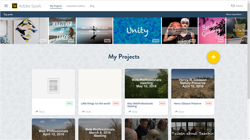
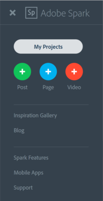
As mentioned, there are three separate applications within Spark. Once you login, you are presented with a choice as to the type of creative document you wish to develop. If you have already developed projects, they are visible. You can also click on the + icon to create a new one. You can also click on the “hamburger” navigation on the upper left at any time to switch between these applications. Those who know me realize that I am “graphically challenged” (ok, “follicly challenged” as well). One of the features I like about Spark is that you are provided with examples and templates so you can immediately focus on your message. You are guided through some of the creative aspects. Obviously, you can always change those aspects as you refine your work.
As mentioned, you can easily switch between applications (for example, you can create an image in Post and immediately use it in Video or Page).
Here is a quick tour of these applications when used in a browser.
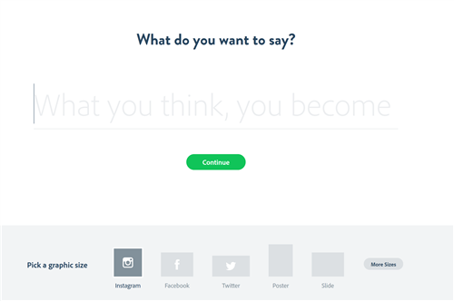
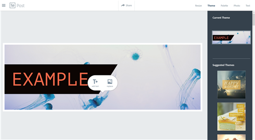
Post – This application can be used to create graphics (banners, posters and so much more). One starts with a message and then builds the image around that message. As you see below, you are asked one of the key questions when we begin to communicate with others (what do you want to say). You choose the appropriate graphic size and then continue.
You have the ability to choose from a number of themes (the font, colors and photo are initially selected for you). Of course, you can change the photo, font, colors and so forth; you can search for photos available via Creative Commons license or use your own.
If you follow the above tabs (Palette, Photo, Text), you have a lot of creative choices. I encourage you to experiment.
Page – this application was formerly known as Slate. It allows you to quickly assemble a written document (typically a web page) which contains text, photos, videos and more. The options are shown below. The Glideshow is an interesting photo effect. Yes, one can create a video in Video and then include it in Page. I like how all these applications are tied together and allow you to focus on your message.
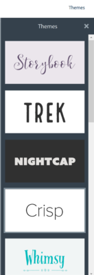
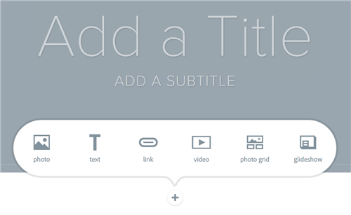 When working with Page, you have the ability to choose from various Themes (some are shown below).
To me, this application is the “glue” which allows one to create materials to communicate your message. You can include your images and video and photos in one spot.
The vexing aspect of this application (which I hope is resolved soon) is that one can only view this as a web page. If you try to create a PDF version (for archival purposes), the results are not as expected. You are also reliant on these pages to be hosted on the Adobe servers. I do hope there is the ability to download these (for hosting on your own server or as a PDF for archival purposes) relatively soon.
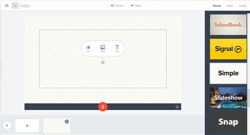
Video – this application was previously named Voice. You are provided with starting templates and can also build from scratch. You can add photos or icons or text and then record your message. Obviously you need a microphone to include your voice. You also see there are a number of themes (on the right). There is a variety of background music you can include. Copyrights are already handled for the music tracks available. I caution you if you use other music to make certain copyrights allow it to be used in this manner.
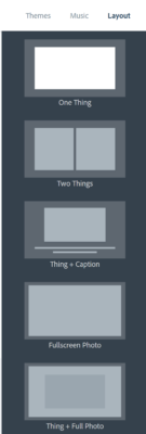
You can also select from a variety of layouts for each of the slides. These are shown in the screen capture below.
Overall, I think the web version of these applications will allow many more students and teachers to utilize these in development of creative materials for use in teaching and learning.
Of course, the iOS apps have also been updated with the Spark name. These are presently 3 separate apps (and one can toggle between them when creating content on an iOS device). For reference purposes, I have included screen captures from the AppStore.
I encourage you to experiment with Spark. As always, I am interested in your comments.
