There have been a number of discussions at various WebProfessionals.org meetings about the concept of “design in browser.” As the spring semester starts to draw to a close, I thought it might be an appropriate time to review this concept as it helps bring a number of aspects of web design into focus. It is also a good way to confirm you really understand working with HTML, CSS and related technologies.
The two main tools I recommend using when designing using a browser are the Chrome browser and Brackets as an editor. In the most simple form, one modifies the CSS on a given page directly in the browser and then copies the modified code and pastes it into the associated document. This is enabled because of two capabilities in Chrome:
- the inspection tool (this will also open the Developer tools) (Ctrl[or CMD]+Shift+i)
- device mode (Ctrl[or CMD]+Shift+M)
I suspect many students reading this article have not worked extensively in this manner. Let’s get started.
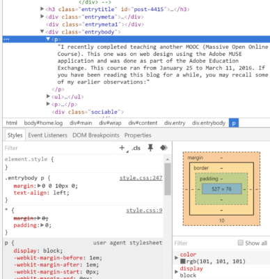
First, we need to activate the Developer tools (Ctrl[or CMD]+Shift+i). Once we have the Developer tools open (I keep mine on the right side of the screen), we can then right click on a part of the web page and select Inspect.
This highlights that part of the page (see below) and positions us in the proper location to work with the HTML and CSS in the Elements part of the Developer Tools.
 We see the details in the Developer Tools. We also see the CSS (including line numbers and the names of the appropriate files).
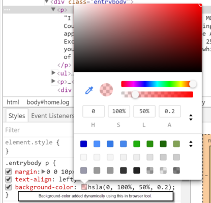
We can then click on these items and modify them (or add new declarations, for example). In this case, I have changed the background color (using the color selector). I could also use the color picker option to select any color from an image or another part of the web page. If you compare the image above with the image below, you will see that I added the background color to the .entrybody p declaration.
This results in the following change to the appearance of the web page.
 Of course, these changes only appear for the duration of that browser session. One needs to copy the changes and then paste them in the appropriate location in the appropriate CSS file. In the screen capture below, I have highlighted the part of the CSS which has changed and I can then copy and paste it appropriately.
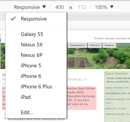
The second item we need to be aware of is the device mode. I highlighted that option in the screen snippet below.
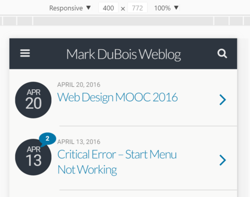
We can choose from a number of different devices (and screen sizes). The page displays accordingly (we don’t need to resize the browser window).
However, we may need to refresh the page to see the proper results. In the above case, this renders more appropriately after a refresh.
The last piece of the puzzle needed is a text editor. In this case, I prefer Brackets since it will automatically update the file in the Chrome browser once a change has been made [Live Preview].
Now that we have a base level of understanding, let’s investigate what design in browser is all about. For purposes of this review, I decided to use the HTML5 Boilerplate as a starting point. I created a separate folder for all the associated files (HTML, CSS,, JS, and more) and then pointed Brackets to that folder and opened the index.html file in Brackets. The reason I prefer Brackets is that as soon as a change is made in your code (and saved), Live Preview updates the page in the Chrome browser (no need to do a refresh in the browser).
If you have already developed a style tile with your client, you can use the chosen colors and fonts. If not, this is a solid opportunity to try out different colors and fonts and observe their effect on the developing page. If one if beginning a new site entirely, I believe it is best to start with a mobile view and develop the initial page with that in mind. One then expands to other views (such as tablet and desktop). The main reason for designing in the browser is that one can make quick changes (assuming you know CSS) and observe the effects immediately.
Consider this simple example (which would require many images and masks if done in alternate prototyping approaches (such as creating a mock-up in Photoshop). One can also apply this logic to working with responsive fonts and many other aspects of the design of the site.
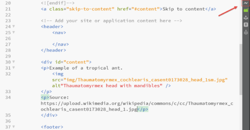
First, I start with the basic HTML (shown below). After saving my work, I click the Live Preview icon in the upper right corner.
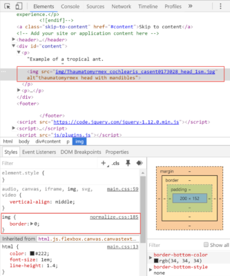
This opens the Chrome browser and I can then inspect the image element. This is shown below. I highlighted the element and the associated CSS.
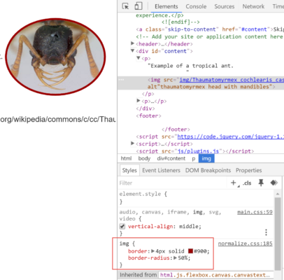
Next, I add some more CSS to the image to see if I like the effects. Of course, I do this in the browser. I set a colored border to the image and apply a border-radius property. Note that if I wanted a perfect circle, I could have started with a square image (or applied other CSS declarations; however, I wanted to keep this demonstration simple).
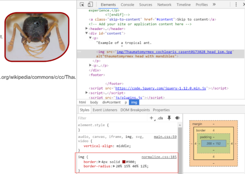
I don’t like this look and want something a bit more stylish (in my opinion). Therefore I set different border radius values. Remember TRBL (you can get into trouble with CSS if you don’t remember the order Top, Right, Bottom, Left – hence TRBL).
Ok, I like this look. Therefore, I can copy the CSS and place it in the appropriate location (normalize.css around line 185) using Brackets.
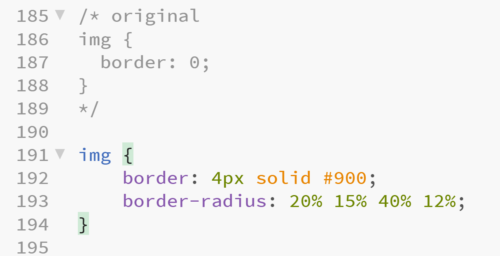 When I save my work and return to the browser, the change is reflected. I could then move on to the next task (perhaps working with responsive text).
Had I chosen to do this in Photoshop, I would have had to generate multiple images (with masks) and I would not have been able to rapidly make changes. This is one of the primary reasons one should consider designing in the browser.
I hope you found this brief introduction useful. I look forward to your comments.

