Adobe recently released a new iPad only app focused on creating content. One can then view this content in browsers on any Internet connected device. The content is displayed in a manner appropriate for that device. The app is called Slate (I placed the logo below). The tag line “Make your words and images move” sums up the purpose of this app.
In a nutshell, I find this app makes writing fun (and makes me want to write more and more about various topics). I find this app very easy to use. For those who create newsletters or need to publish announcements, this seems like an ideal app. There are a number of pre-built themes and most include various animation capabilities. Let’s investigate the app a bit more.
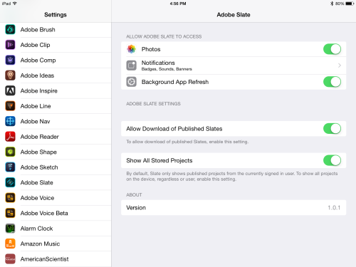
First, a note. If you are working with the app (and using more than one iPad), I encourage you to modify the app settings to be able to download existing materials. I have included a screen capture below.
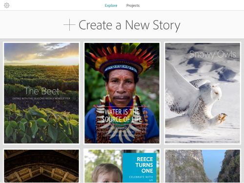
As with many apps, this one is free. You will need an Adobe ID to use it (also free). Once you open the app (and sign in), you will have the ability to review existing samples or create your own project. If you have already developed projects, you will find them under the projects tab.
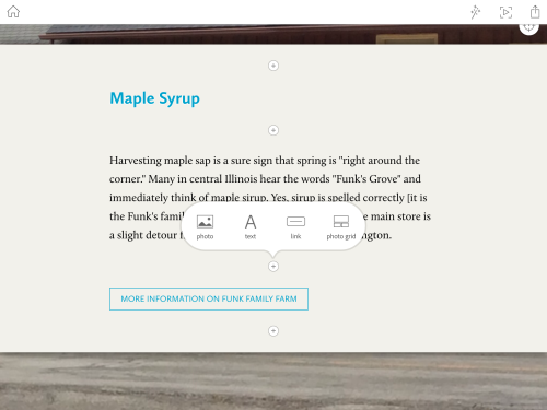
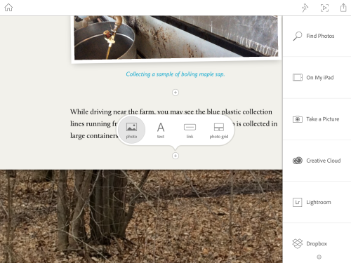
I chose to create a new project. You are presented with the ability to add a title (and subtitle). You can also add a photo. The majority of the interface is choosing photo, text, link, or photo grid and entering appropriate content. This is shown in the screen capture below. I just tapped on the small plus (+) icon to insert more content into my work in progress.
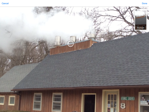
When you add a photo, you can also tap on the focus icon (lower right of the photo) to select where the focus should be placed. Since the output form Slate can be viewed on a number of different devices, it is important to know where the image should be centered (since the image may not display in exactly the same way on all devices). You simply move the focal point to the desired location. In my case, I chose to focus on the steam rising from the boiling maple syrup as shown in the screen capture below. You see the small circle by the chimney below.
You can add photos from a number of sources. These are shown in the screen capture below. In addition to photos on your iPad, you can obtain them form Dropbox or other sources where you have stored photos. You can also search for Creative Commons photos. If you choose this latter approach, you do not need to worry about citing the source as they will automatically be included with the credits on your Slate when it is published.
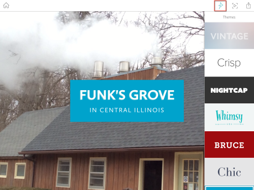
Once you have entered your content, you can choose from a variety of themes. These are shown in the screen capture below. I highlighted the theme selector with a red rectangle.
Each theme has a different look (fonts, colors and so forth). One will also find different animations associated with each theme. I have found it best to develop my content and then try out different themes. There is a preview icon (next to the theme selector in the image above). When you are ready to publish, you can upload it to Adobe servers (far right con in the image above).
Ok, so what do the end results actually look like? I put together an example – this is a short article about the Funk’s Grove area in central Illinois. If you follow this link, it will open in a new browser tab. I encourage you to view the Slate I created on a number of different devices.
For those who are curious, the HTML 5 code generated from Slate validates (using the W3C validator). The CSS-3 code generated throws a number of errors.
I have also embedded the example below. Another nice feature about Slate is that you can copy embed codes within Slate and use this with weblogs. Note the image is captured and placed as a link below.
I like working with Slate. However, there are some improvements I would like to see.
First – I would like to see an Android version of Slate. I know a number of students who could benefit in the use of this app, but who are simply unable to afford an iPad (a number of Android tablets are much less expensive).
Next, I would like to be able to slightly modify themes. I have encountered instances where it would be nice to be able to change the font color (as the one for the preferred theme interferes with a photo background, for example.
I would also like to see the ability to share “works in progress” with others. For example, I teach a class – CMWEB 115 Writing for the WWW – and I would like to be able to provide a starting point for an article and share it with all students in class. I presently don’t see a way to accomplish that. Yes, I can publish the sample and use that, but each student would then have to reproduce it.
Another item I would like to see is the ability to save the end project on my iPad or post to a server of my choosing (rather than relying on placing it on an Adobe server).
I am curious as to your experiences with Slate (and whether you plan to use it and what you plan to use it for). As always, I look forward to your comments.
