Periodically, I come across something unexpected while searching for resources for my classes. I have been testing out one such app (iPad only – sorry Android). It is called Project Luca. I thought it might be worth mentioning this to others. I have plans to incorporate this into our CMWEB 115 class (Writing for the WWW). Let’s first examine the output. I put together a quick article describing the National Web Design Contest held in Kansas City in June, 2014. This was created on my iPad in under an hour. Note the effects one can employ when including images (how they move relative to the rest of the page). Yes, you do have to apply to gain early access (readers of this weblog know I tend to be an early adopter). Let’s examine the iPad app in a bit more detail. The app logo is shown below.
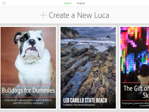
When you first open the app, you are able to review completed examples of work or create your own project.
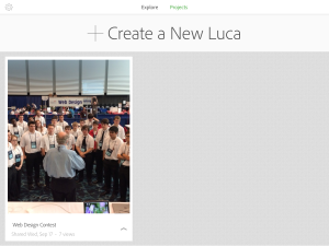
I found the interface to be rather intuitive. Obviously, you tap on the + to create a new Luca project. You can add text and images. You can also modify an existing project as needed. In the screen capture below, you see that I have already created the document referenced above.
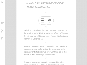
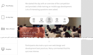
When you create a new Luca project or edit an existing one, you can easily add text or images. Just click on the + icon in a given section. You can apply a limited number of themes if you want to change the overall appearance of your work. I would expect more themes in future updates.
Photos can come from a number of sources (such as Dropbox, photos on your iPad or your iPad camera directly). You can also specify how the photo will display and are prompted to enter a caption after the photo is included in the document.
Once you have completed editing your work, you can upload it to a central spot and reference it (as I have done in the document I referenced). As I mentioned, I find the interface very intuitive. I plan to use this app in the CMWEB 115 class at some point as it demonstrates alternate ways of quickly creating content for a client. In most cases, we have a compelling story to tell and this tool seems to help with the story telling.
There are some improvements I would like to see in future updates (I realize this is a free app). First, it would be most helpful if ojne could easily include credit for the individuals who took the photos included. I am hoping this is included soon as I would like to give credit where it is due.
I would also like to see the code be more compliant with existing web standards. For example, if I run the above document through the HTML validator at the W3 site, I get 24 errors and 24 warnings in the HTML5 code. I also see a number of CSS validation errors when I use the corresponding CSS validator.
That being said, for an initial app involved with communicating a story, this seems like a great way to get started. I am curious if anyone reading this post has experience with Project Luca? Would you consider using it if you have no experience? I look forward to your comments.
