Now that I am more familiar with my Ms Surface tablet, I thought it would be time to explore specific applications. First stop would be Internet Explorer 10. It comes in two flavors on the Surface. The first is an app (no plug-ins such as Flash Player are allowed). The second would be the desktop version (which comes with several plug-ins, including Flash Player). Let’s look at both implementations as these are presently your only choices to view web pages on the device (since it is Windows 8 RT on an ARM processor, there are no other apps I could find in the Windows store; you can not download other browsers from their respective websites since they won’t run on the hardware).
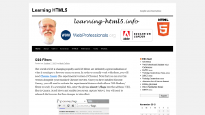
IE 10 app (you access this from the start screen by tapping on the Internet Explorer tile. The first thing I noticed is that the interface is significantly different from earlier versions of Internet Explorer. A screen capture is shown below (click on it to see the full screen version). Note that the address bar is near the bottom of the screen.
So, I can enter a new URL or reload the page (icon to the immediate right of the address). The pin icon allows me to add this to my favorites list or pin this page to the start screen. The wrench icon allows me to search for something on the page or view this site on the desktop. All is good. After I start scrolling around on the page, I see something like the following.
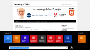
Wait a minute, what happened to the address? To get that back, you need to swipe from either the top of the screen or the bottom of the screen. Don’t swipe from the left side as that will take you to the previous app you were working with. Swiping form the right will yield the charms. You also have to make certain you are swiping from the edge of the Surface (as opposed to within the web page) as the latter will scroll down the page. When you swipe properly, you will see something like the following.
If you tap on the + icon, you will open a new tab (upper right). If you tap on the ellipsis (…) you can open a new InPrivate tab. I make the assumption this is similar to other browsers where identifying information is not provided to web sites. I have not tested this to confirm my assumption. Ok, I am now a bit more familiar with the interface. Oh, wait, where are my favorites? The best approach I have found to this is to actually tap in the address. This will open your favorites and recent websites (as tiles).
As you can tell, the interface is a bit different. It took me a little while to investigate to learn all these features. I wonder if a typical user of the app will bother? As I mentioned in a previous post, user experience is important. And, this is a vastly different user experience from previous browsers. Perhaps this will be the accepted norm in the future? Time will tell.
So, how does this app fare on some of the testing sites? Details are shown below.
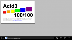
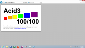
First stop was the ACID3 test page for browsers. Results are shown below.
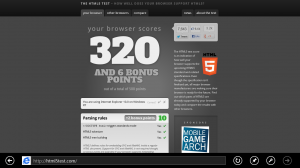
I was impressed with this one. Well done IE 10. Of course, IE 9 also scored 100/100. Next stop was the HTML5 test page. Results are below.
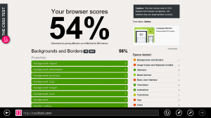
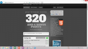
Given that IE 9 on Windows 7 scores a whopping 138, this is a vast improvement. For comparative purposes, Firefox scored 357 and Chrome scored 434 (I didn’t include bonus points in any of these results). Last stop, CSS3 test page. Results are below.
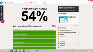
Again, this is an impressive score when compared with IE 9 on Windows 7 – 32%. For reference, Firefox scored 55% and Chrome scored 62%.
So the IE 10 app has a different user experience (which took me a little while to get used to) and a vast improvement in the handling of modern web technologies (like HTML5 and CSS-3). Obviously, there remains room for improvement, but it is still a great improvement. Now, let’s examine the desktop version.
But, first, we really should close the app. This took me quite a while to figure out. Essentially, you drag a slow line from the top of the app down to the bottom of the app. As you near the bottom, the app shrinks in size and then closes. If you don’t do this, the app continues to run in the background. Of course, it will eventually close on its own if you don’t revisit it.
IE 10 desktop on Windows RT Surface – this one comes with Flash Player installed. The interface is shown below. This is the more traditional look and feel of a browser that most are used to.
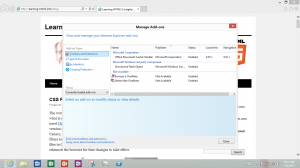
If you click on the above image to view it in full size, you will see that the interface is very similar. For example, I can click on the settings icon and manage my add-ons. That is shown below (where Flash Player was installed by default).
I did not retouch the above image at all. It is a straight screen capture from the Surface tablet. So how well does the IE 10 desktop version compare on the ACID3, HTML5, and CSS3 tests? The results are below.
Overall, I am glad to see identical results. This implies the core engine is the same for both the app and desktop versions of IE 10. I am also glad to see significant improvement in how IE 10 handles modern technologies like HTML5 and CSS-3. I would still like the ability to install other browsers on the Surface tablet. Perhaps one day, I will open the Windows Store and be surprised.
I am curious if you found these observations useful. Comments are encouraged (as long as they are not SPAM).
