Bootstrap is a framework for front end web development and uses HTML5. One can employ responsive web designs with relative ease (the page will shrink and images will resize as the amount of screen real estate is reduced). This framework uses a 12 column grid for initial layout of items. It was developed at Twitter and relies on LESS CSS and jQuery. I recently spent some time completing the lynda.com course – Up and Running with Bootstrap and thought it might be helpful for students to create this introduction. I understand that this framework is included in Joomla 3.0 so it may be helpful to know from a content management perspective as well. For an overview of Bootstrap, their scaffolding page is a great starting point. So, how does one get started?
To begin, one downloads a copy of the framework (it is a zip file and contains both the source and minified versions of CSS). For production work, I would use the minified versions. All my examples do not (so you can more easily view the code if desired). When one first extracts the files, there are three folders: css, img, and js. Your first step would be to create the initial HTML file. Note that I provide a starting file so we can examine how to begin. If you view the source code of the starting file, you will see the following in the <head> part of the document:
...
<meta name="viewport" content="width=device-width, initial-scale=1.0">
...
<link href="css/bootstrap.css" rel="stylesheet" type="text/css">
<link href="css/bootstrap-responsive.css" rel="stylesheet" type="text/css">

<!-- HTML5 shim for IE backwards compatibility -->
    <!--[if lt IE 9]>
      <script src="https://html5shim.googlecode.com/svn/trunk/html5.js"></script>
    <![endif]-->
I have set the viewport to the device width with an initial scale value of 1.0. This means that the page will size properly in a given device, but the visitor could still pinch and zoom if desired. The bootstrap CSS files are included in order (bootstrap.css should be listed first). If you wanted to customize the CSS, you could add a link to your css file after the bootstrap -responsive.css. I would recommend taking this approahc if you want to customize bootstrap (such as changing default colors of buttons).
In the <body >portion of the document you will see the following. This gets at the heart of using bootstrap. One adds appropriate classes. If you are using a tool like Dreamweaver CS6, you will see the choices appear in the classes list. It is considered a best practice to have a container which holds all remaining HTML on the page. One applies a class of container-fluid. One can then add multiple rows using a class of row-fluid for each. Note also the class of span12 for the <section> element. I mentioned that Bootstrap is based o a responsive 12 column grid. You can allocate your elements across this grid using any combination that equals 12. There is a span1 through span12 set of classes to accomplish this.
<div class="container-fluid">
  <div class="row-fluid">
    <section class="span12">
      <p>View the source code</p>
    </section>
  </div> <!-- end row-fluid division -->
</div> <!-- end container-fluid division -->

<script src="https://code.jquery.com/jquery-latest.js"></script>
<script src="js/bootstrap.js"></script>
You will also note that I provided links to jQuery at the bottom of the file. In some of the examples we will rely on jQuery to accomplish the heavy lifting. I provide a few examples to help you better understand what the capabilities are with Bootstrap. As I mentioned earlier, I got many of these ideas from following the lynda.com course on this topic. In all these examples, I recommend viewing the source code to confirm you understand what is happening.
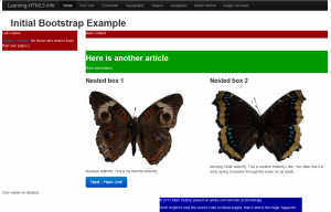
Fundamentals – In my initial page, I provide some hints as to what you can accomplish with Bootstrap. We will cover the navigation at the top of the page later. If you examine the page (screen capture is below), you will note that it is divided into a couple of sections. Yes, I use hideous colors to outline the various parts.
At first glance, you will see the use of columns to arrange information. You also see a footer and a button. All of these items are styled using existing Bootstrap classes. For example, to obtain the effect on the button (big and blue), one codes classes of btn btn-primary btn-large – that is it. If you look carefully at the image (or the actual file), you will see some content indicating it is only visible on the desktop. This implies there must be other code. The complete code is shown below. This is all it takes to make some items appear in different resolutions.
    <section class="row-fluid">
        <div class="span4 visible-desktop">
        Only visible on desktop.
        </div>
        <div class="span4 visible-tablet">
        Only visible on tablet.
        </div>
        <div class="span4 visible-phone">
        Only visible on phone.
        </div>
     </section>
Note the use of the class visible-phone or visible-tablet above. That is all it takes. Clearly there are some features one can get used to with this framework. You may note that the images of butterflies are nested in columns (I encourage you to view the source code to see how this is accomplished with the span6 classes.
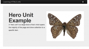
Hero Unit – this is a part of a web page which draws attention to a specific block of text. Often there is a different background. I provide an example of this using Bootstrap. Examine the screen capture below demonstrating this effect (with a subtle gray background).
What sort of code was needed to render this effect? I provide the entire line of code below:
<header class=”span12 hero-unit“>
That is it. Again, I think this framework has some potential for rapidly creating a website which has a professional appearance with limited graphic skills and limited CSS knowledge. Obviously, you would need to know more about CSS to make changes to the defaults.
Thumbnail gallery – there are many times one needs to include small images on a web page (for example a product catalog). A working example is provided. I encourage you to review the source code. The key part is found below.
<ul class=”thumbnails“>
<li class=”span4″>
<article class=”thumbnail“>
<img src=”images/Buckeye.jpg”…
Note that one needs to include a few classes to generate the appropriate effects. In this case, it is important to make certain the class of thumbnails” is applied to the unordered list and the class of thumbnail is applied to each of the image containers.
Typography – there are a number of interesting effects in Bootstrap. I provide this example page to demonstrate some of these. Examine the linked page (it will open in a new window/ tab). Then view the source code. Let’s start at the top. Assigning a paragraph a class of lead will change the line spacing and font size. The <blockquote> element will have some additional styling without even adding a class. Assign a class of unstyled to an unordered (or ordered) list to remove the bullets. For definition lists, one can assign a class of dl-horizontal so that the details immediately follow the term (on the same line).
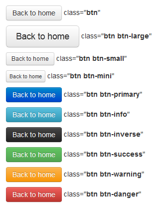
There are a number of default styles you can apply to links to make them appear as buttons. For all of these, use the class of btn first to style the link as a button. I provide a screen capture below with the various default choices.
If you want different colors, I recommend using a separate stylesheet and linking it after the bootstrap-responsive.css file.
Styling images and using glyphs – Another example page covers the styling of images and the use of glyphs. If you want a border around an image, specify one of the following classes: img-circle img-rounded or img-polaroid. The first creates a circular border around the image. The next provides for rounded corners. The last places a white border around the image.
One can also use a number of glyphs in bootstrap. One can view the complete set of glyphs at the Bootstrap site. To use any of these, simply insert an empty <span> element with the appropriate class. If you want a white version instead of the default darker version, specify icon-white. For example class=”icon-arrow-up icon-white“.
Navigation – My example page contains a number of different styles applied to various navigation approaches. For example, if you want to have an unordered list appear as breadcrumbs, you apply a class=”breadcrumb” to the <ul> element. Use a class=”active” to highlight any element (list item). Use a class=”disabled” to grey out a given option. Note that Bootstrap only applies styling. While a given link may appear greyed out, it is still possible to click on it. You would need to employ additional HTML or JavaScript to disable the actual link itself. If you are working with a content management system which returns a number of pages of information (perhaps from a search), you can use class=”pagination pagination-centered span12″ the second option (pagination-centered) is to center the pagination on the page.
If you want to style next and previous buttons, consider the following code:
<ul class=”pager“>
<li class=”previous disabled”><a href=”#”>Previous</a></li>
<li class=”next“><a href=”#”>Next</a></li>
</ul>
As you can see, one has a fair amount of capability through the use of a few classes in Bootstrap. In the example page you will also see examples of tabs and pills (buttons with very rounded corners). You can also see how the top navigation is styled. Again, I encourage you to view the source code to see how various effects are achieved.
Modal windows – In this example, we see the use of what appears to be a pop-up. Click on the button to see the effect. Since this is all part of one page (and jQuery is used for the display and slide effect), search engines will have a better time indexing all the content on the page. To generate this effect, we need the following bit of styling…
<section id=”openWin” class=”modal hide fade“>
<header class=“modal-header“>
<button type=”button” class=”close” data-dismiss=”modal”>×</button>
</header>
<div class=”modal-body“>
One should also include a class=”modal-footer” for the close button. The data-dismiss is part of jQuery (which is why we need to include the link to those files in our documents). The button to open the window is a link which points to the id of #openWin. That is what triggers the initial opening of the window. Again, the majority of the effort to accomplish these effects has been handled by BootStrap.
Image carousel – this is the last effect covered in the lynda.com class that I wanted to emphasize. If you are interested in learning more, view their course – Up and Running with Bootstrap. I also provide an example page for this effect. Again, the effects rely on jQuery (which is why there is a link at the bottom of the source code). To achieve the effect, we set a division to a class of carousel. We nest another division with a class of carousel-inner. Within that division, we nest another division with a class=”item“. We can also include a class=”carousel-caption” if we want to include a caption for an image. By default, the caption will cover part of the image so you need to plan accordingly. Of course, you can always modify the CSS to accomplish any desired improvements.
Wow, that was a lot of information. I hope you have a better understanding of what you can do with the Bootstrap framework. I look forward to your comments below.


