I recently loaded Windows Server 2012 Standard into a Virtual environment. I downloaded this from the MS DreamSpark site. I noted a number of interface differences and thought it might be useful to some of my network security class to cover some of the basic changes. The installation is similar to any Windows install. Once installed, the interface is more like the Windows 8 Metro style interface than the more traditional Windows Server interface. I am just including a few screen captures at this point. A more detailed analysis will be coming later (it is a busy week this week).
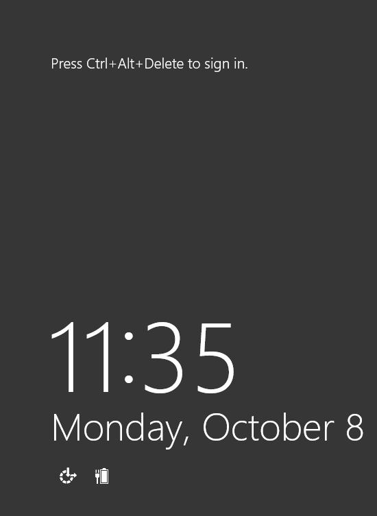
Note that this weblog post is all about the interface itself. The first major difference is the login screen (shown below). For all these images, click on them if you want to see the full screen capture.
Ok, now that I have successfully logged in to the environment, the first obvious difference is the lack of a start orb. Note that I only see links to Server Manager, PowerShell and other items in the task bar.
In order to see the equivalent of the start orb, I must move the cursor to the extreme lower left corner and I will then be presented with a start option (as shown below).
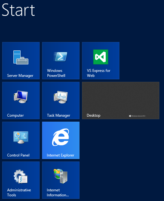
If I click on the start icon, I am presented with a screen reminiscent of the Windows 8 Metro interface (or what ever it is called now).
Note that I have installed additional items (like IIS) so there are additional items on the above menu. As with Windows 8, one can make the desktop icon smaller and one can reposition the various items on the screen.
For those who are curious, Internet Explorer 10 comes with Server 2012 and seems to handle most CSS-3 examples I tried (such as multi-column).
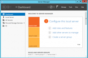
Server Manager interface is a bit different as well. [Click on the image to see a larger view.]
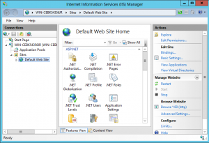
IIS Manager (Internet Information Server) looks similar to previous versions (the interface is a bit different). [As mentioned, click on the image for a larger view.]
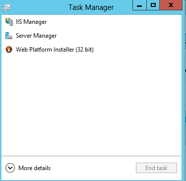
Lastly, Task Manager has a number of interface changes. The initial view looks like that shown below.
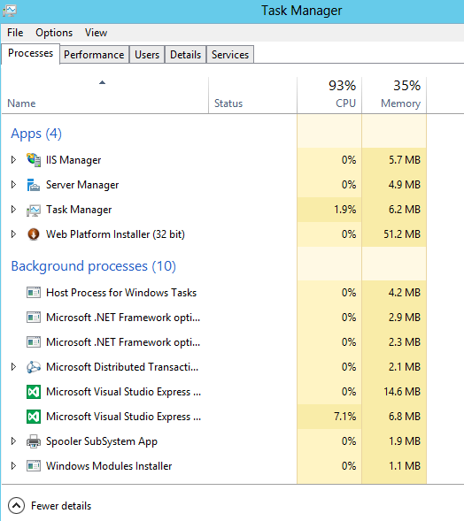
If one selects “more details,” one will see the following. In this case, I am looking at processes first.
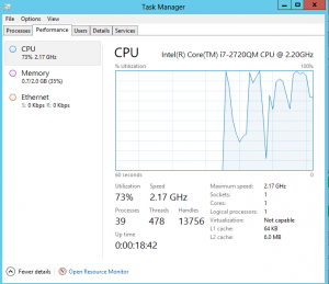
 One can then choose the performance tab and see items such as network statistics and more.
So, there are a number of interface differences. As time permits, I will cover some of the differences in IIS and PowerShell. As always, feel free to comment (I need to approve the comments due to the volume of SPAM received).
