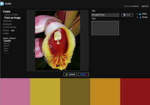
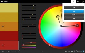
The next Adobe Touch App I wanted to review is kuler. This app is similar to the features you can experience on the WWW at http://kuler.adobe.com. The big advantage to using the Touch app on a tablet is the ability to work offline. For comparison purposes, I provide a screen capture of the kuler website (once I have authenticated and uploaded a photo). With all these images, simply click on the image to see the larger version.
For those who wish to work along using the kuler Touch app, I provide the original photo. You may use this for educational purposes only and should give me credit as the photographer. I took this photo of a tropical flower in Belize in 2007. Simply use your browser to save the file locally so you can include it.
Task/ mission – We will use this image as the starting point to select a possible set of colors for use on a website. I often find it easier to use a photograph and build a color theme from that when working with a client. Your mileage will vary.
Step 1 – open the kuler Touch app on your tablet (I am using a Samsung Galaxy Tab 10.1). You will need to locate the desired image and import it into the kuler app.
You should use the add image icon ![]() to include a desired image as a starting point for your color swatch. This is very similar to what you would do on the kuler website. A screen capture is shown below. Note that you can locate images from a variety of sources. I strongly recommend you respect copy rights on all images being used. In the example below, I uploaded the image to the Adobe Creative Cloud so I could easily import it into kuler.
to include a desired image as a starting point for your color swatch. This is very similar to what you would do on the kuler website. A screen capture is shown below. Note that you can locate images from a variety of sources. I strongly recommend you respect copy rights on all images being used. In the example below, I uploaded the image to the Adobe Creative Cloud so I could easily import it into kuler.
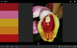
Step 2 – once the image has been imported, the app will automatically select some potential colors. You can choose these (default swatch is on the left). You can move the small circles around to modify the colors. Decide on which colors are appropriate for the desired look on the website.
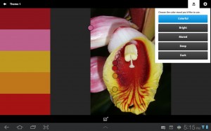
You can also tap on the small flower icon (upper right) and choose from additional preset color combinations (based on the photo you have imported). I recommend experimenting with the various choices. Don’t forget you can modify any of these choices by moving the small circles for each of the chosen colors.
Step 3 – once you have decided on the desired color swatch, long tap on the default name so you can change it before saving the swatches. Obviously, you can change this at any time, but I find it easiest to make the change before saving my file.
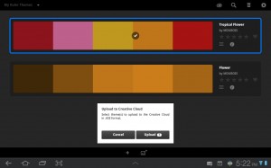
Step 4 – you can then upload your swatch to the Adobe Creative Cloud (as shown below) or further refine the colors (in step 5).
Step 5 (if needed) – you can also tap on the color swatch and open the kuler color editor. Additionally, you can decide whether to work with rgb values or hsl and so forth.
That is it. You should now be able to import an image into the kuler app and choose a desired color combination for a website based on the colors in that image. As noted above, you can modify these as needed. If you need more information about color theory and related concepts, the kuler website has a number of helpful links.
Let me know if you find this brief introduction into the Adobe kuler touch app helpful. Please use the comments below.
