This is part of a continuing series of posts dealing with the Adobe Touch App – Proto. I have been examining this (downloaded from the Android Market and installed on my Samsung Galaxy Tab 10.1). Previous posts in this series included: Proto Cheatsheet, Form Design with Adobe Proto, and Adobe Proto Navigation and Wireframe. I thought it was now time to focus on the HTML 5 code generated by Proto when you build a wireframe. In addition to understanding what you are creating in the actual wireframe, I am hoping this post also points out some things I would like to see improved in future versions of this product. This post will focus on the majority of elements (excluding form elements and navigation – that is the focus of a future post).
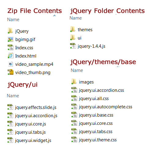
Before we dissect the code itself, let’s examine the files included in the zip file one would download from the Creative Cloud. I am impressed that so many files and folders are automatically generated (including proper inclusion of so many of the necessary jQuery files). Since I tried to pull in most of the known Proto objects, I suspect this folder/ file structure is larger than most wireframes. The screen capture below is not meant to be all inclusive, but should give you an idea of what is actually included when you place items in the Proto wireframe.
Let’s examine some of the snippets of HTML (and associated CSS and JS) code generated when you create wireframes with Proto. These are listed somewhat in the order of items you will find in my Proto Cheatsheet.
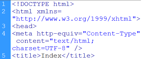
Let’s first examine the document heading source code (and document name). By default, the file is called Index.html. Makes sense (unless you are using a Linux system, which many do). In my opinion, the filename should be index.html (lower case i). We see the first lines are HTML5. These lines provide a solid starting point for a web designer who needs to modify the prototype. A screen capture is shown below [ you can always view these in full size by clicking on them].
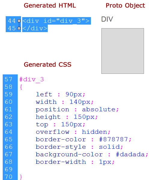
Division – In many wireframes, we need to specify a containing region (typically using one or more <div> elements to define such a region). I tapped on the DIV icon in Proto and the resulting code was generated. Obviously, one can re-size the object in Proto; this is the default value. As one can see, CSS is used for absolute positioning. I understand this approach to generating a wireframe; obviously a web designer would need to modify all of these. One question that comes to mind is where does the number 3 come from (as in id=”div_3″)? The best I can determine is that these numbers are automatically generated by Proto based on how many of these you have included in the current (or previous) wireframe.
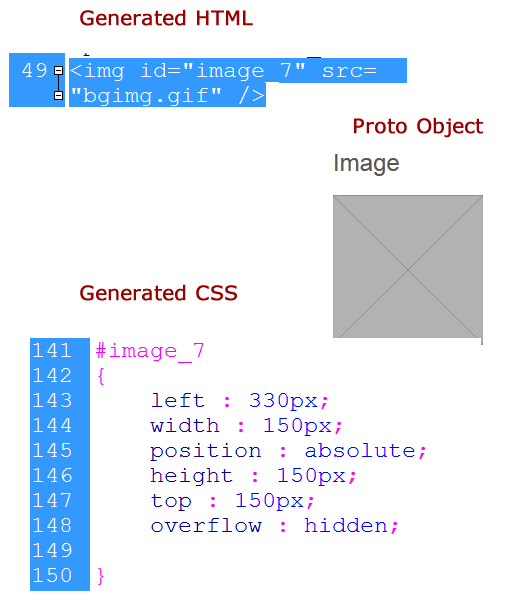
Image – When one includes an image in the wireframe, there is an actual gif image included (personal note, I would prefer a png image).
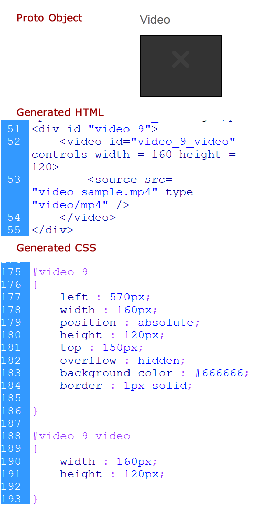
Video – An actual sample video is inserted when one chooses this option. Let’s first look at the object and code. Note that the object displays differently in the Creative Cloud than it does on the tablet (you don’t appear able to preview the video in the Creative Cloud).
The sample video (screen capture only) is shown below.
Heading – I was surprised to learn that all headings (no matter how large the text) are paragraphs. In this case, the wireframe is not conveying any structure to the document. To me, this would be one feature to watch out for as many would assume a large text item like that shown below would be a <h1> element.
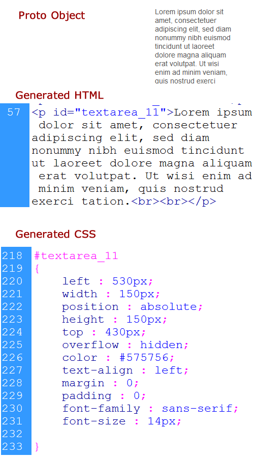
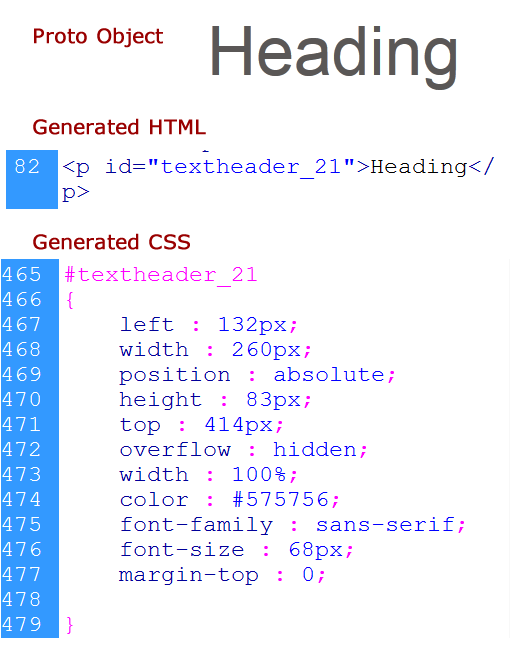 Paragraph – obviously, this is a paragraph of text as one would expect. Details are shown below.
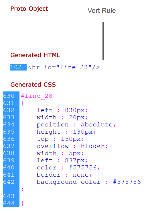
Vertical Rule – This is represented as a vertical line. As expected, it is formed using a horizontal rule styled with CSS. Details can be found below.
Table – Lastly, we examine the generated code for the table object. As expected, this has fairly standard code for a data table. Details are below.
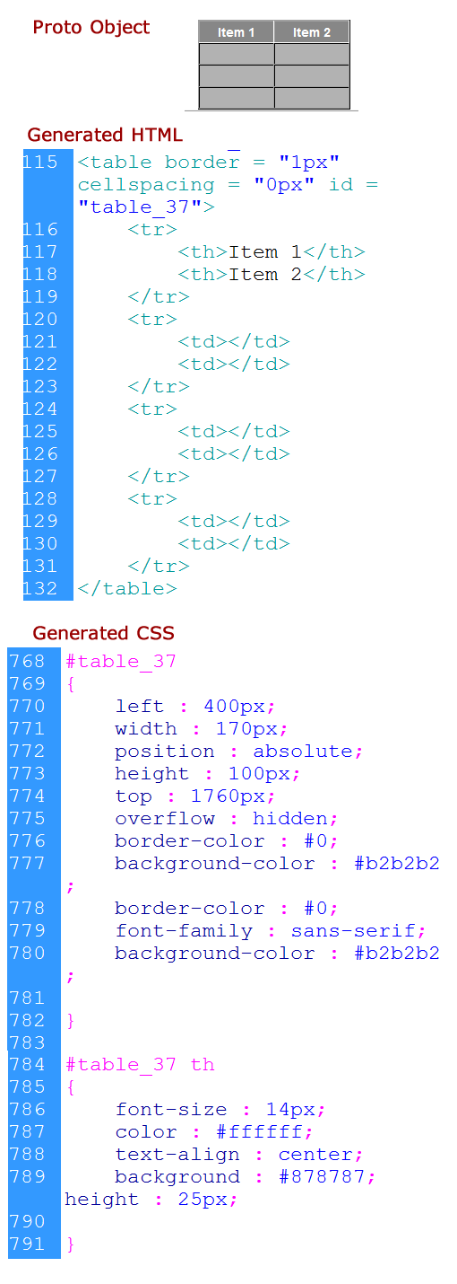 As you can see, the majority of code generated is as expected. The one item I found unusual was the heading object and the resulting code rendering as a paragraph. I plan to follow this post up with another focusing on navigation and form elements. As always, I am interested in whether readers find this information useful or have additional insights to share.
