Now that I have created a “cheatsheet” for common Proto gestures and discussed creation of a form with Proto, I thought it time to turn my attention to the process of creating a prototype website (with working navigation). I am creating a wireframe for a site I created with Adobe MUSE some time ago. Thought this would help students better visualize the function of a wireframe since they could see the completed website and compare specific pages.
Very important note. I have found it easiest to fully develop navigation on the initial page I create in Proto. I also try to include any features which would be common throughout the site. It is very easy to duplicate a page in Proto. I have not found any way to move objects between pages within Proto (I hope that is a feature in any new version of the product). Because you can not easily exchange objects between pages, it is a lot easier to put most of what you want on one page, then duplicate that page multiple times. Otherwise, you will end up having to add objects to each page and you may well have a different spacing or different font, etc. between pages. Although these are wireframes, they should still be consistent for the client.
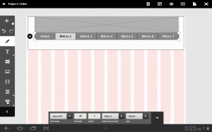
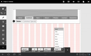
Step 1 – I created a new wireframe (took the web page settings as the default). I consider it a best practice to include navigation in a separate <div> so I first added a background<div> element to the top of the wireframe. I then placed a large image at the top (to be consistent with the final site I would develop in MUSE). Underneath that, I then placed the initial navigation menu. I verified the font size was “reasonable.” Detials are in the image below (you can always click on the image to see the full version with all the details).
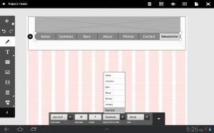
Step 2 – I next modified the contents of the navigation (using actual terms instead of Menu 2, Menu 3 and so forth). Simply select the desired item from the list (see the bottom of the image), then long tap on the word and you can then modify that text.
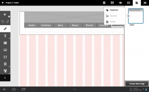
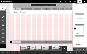
Step 3 – Once I have created necessary elements which will appear on every page (perhaps a bottom navigation as well as copyright, terms of use and similar information), I would then duplicate the initial page. Click on the pages icon in the upper right, tap the initial page and select duplicate form the options presented (see below).
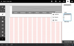
Step 4 – I would then rename the page to the appropriate name. Index Copy just doesn’t seem like a proper name *grin*.
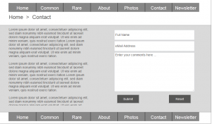
Step 5 – On the duplicated page, I also included breadcrumb navigation (which may be desired by the client on any pages beyond the initial (home) page). I also changed the contents from the default to something more meaningful for the client (again, long tap to select the text and change it). Note that I have only made one duplicate page at this point. Since I want to include the breadcrumb navigation on subsequent pages, I would then duplicate the modified page for the rest of the site). Personally, I have found it easier to develop the initial home page (navigation), then a sub-page, then duplicate the sub-pages for the rest of the site, then create working navigation, then return to each page and fill in the appropriate content the client desired for that page.
Step 6 – Once I have all the pages for the site wireframe, I would next verify that I had all the navigation working. I have found it easiest to create a page, select the text for the navigation to that page (and the home page), link to the appropriate page, then duplicate that page and repeat the process for the subsequent page. This makes it easier/ quicker to verify all your links are working. The alternative is to add all the pages, then go back to each page and change all the links for that single page. I find this latter approach takes much longer than gradually building out the navigation on each page as you create it. Your mileage may vary.
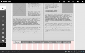
Step 7 – After I have confirmed all navigation is working as desired, I would return to each of the pages and add appropriate placeholder content. Note that since the site is a wireframe, we only need to include content for pages which have a different layout (of course in this example, every page has a different layout).
Step 8 – I would then test the site to confirm that the navigation is working as desired and that the content placeholders are as the client desired.
If you would like to experiment with the resulting code, I have included a link to the files generated from Proto. For those with limited experience with the use of wireframes, compare the wireframe site (after downloading the files generated) with the resulting site developed in Adobe MUSE. The wireframe would be the first step where the client would sign off, the resulting site would be the last step in the initial development process. Obviously, the site could then be expanded with further capabilities over time.
To summarize what I have found to be a best practice when developing a prototype website in Adobe Proto…
- Develop the initial page and include necessary main navigation components. Modify the text for these components to reflect the desired names for each of the links. Do not include a lot of content on this page initially.
- Duplicate the page and rename it. Add any sub-navigation components which would not be found on the main page. Verify the links are working between this page and the initial page.
- Add subsequent pages as needed. Always add a page, change the links on that page and on earlier pages, then test all the links before proceeding to the next page.
- Return to each page and add desired content placeholders (typically done in collaboration with your client).
- Verify all wireframe pages are as the client desires, upload to the Adobe Creative Cloud and have the client review one more time. Once you have a sign-off that this is what is desired, download the zip files and begin actual development of the site in a tool like Dreamweaver.
I am curious if you have discovered other best practices when developing sites in Proto. If so, please place a comment below.
