Those who know me realize I am not a fan of paper. I have not provided paper handouts to my students since 2000. Personally, I find it much easier to organize and locate digital materials.I don’t think I am alone in this view. Of course, a big problem is having to lug a laptop around to access materials. I see this problem is starting to be solved and I believe it will fundamentally change the way we think about web design and how we teach web design.
As I begin to use tablets more and more in my daily activities, I thought it appropriate to start a series of posts summarizing my thought process as it evolves. I expect my insights to change significantly over time as I become more familiar with various apps and approaches. Personally, I think that we are on the cusp of a significant revolution in how we interface with computers (as big a change as when we moved from command line to GUI (graphical user interface). Ok, let’s start…
Adobe recently released various Touch Apps into the Android market (Nov. 15, 2011). Since I have a Samsung Galaxy Tab 10.1, I have been experimenting with these apps on this device. One should be aware that there are minimum requirements for many of these apps (Android 3.1+ operating system, minimum screen size of 8.9 inches, minimum screen resolution of 1280 by 800 pixels). Admittedly, I have only been using these apps for less than a day. However, it now seems possible to use a tablet effectively when meeting with a client to discuss a web design project. From a workflow perspective, I offer the following scenario.
Initial client meeting – Adobe Ideas, Kuler and Adobe Proto would seem to work well in combination. Some clients look for a logo in addition to a website (which is where Ideas could play a role). Kuler would be most helpful in selecting various colors the client would like and Proto would be used for discussions and initial design of user experience for selected pages. Since very few websites are static and most have a mobile component, Proto seems best suited for development of these initial pages. I especially like the fact that one can upload projects to the Adobe Creative Cloud and then share them with others or download them and import into the appropriate desktop tool (like Dreamweaver, Photoshop, or Illustrator). Biggest initial take away for me is that no paper is involved. I can’t think of the number of times I have met with a client and had to take a pad of paper or a laptop or both. Looks like a tablet will now suffice for these initial discussions.
For those who do not have direct access to these Touch Apps or an Android tablet, I provide a few screen captures below so you can have some initial exposure to what it is like working with these apps. Biggest things to remember when working with a touch interface is that a short tap and a long tap generate different results. Also, swipes are useful for exposing parts of the interface at times.
Adobe Ideas. One can import an image from a variety of sources and can then modify it as needed for a creative discussion with a client. I would think this would be very helpful for initial discussions regarding logo design and similar activities. Here is a starting point for something I am presently experimenting with. Yes, I would make many additional changes. Did I mention I have been working with these apps for less than a full day? Obviously, one can click on all these images to see them in full size.
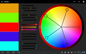
Adobe Kuler. Once one has completed discussions surrounding a logo or branding, one might want to decide on a color theme for a website. This tool comes in very handy for those of us who are graphically challenged. Again, one could work directly with a client to see what colors work well for them. The initial screen capture below demonstrates the key aspect of the interface (similar to the Kuler website). Once can work with a color swatch (and upload it when finished). Again, the ability to work with a tablet when meeting with a client and immediately download and continue working using desktop apps should be a huge time saver. Yes, one might want to prototype the site before deciding on a color scheme. I am just showing one of multiple approaches.
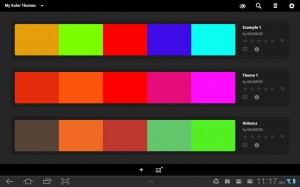
Of course, one has access to all themes created (both public and your private ones). Yep, I did name one of my themes hideous. See if you can pick it from the swatches below. Did I mention I was graphically challenged (and proud of it)?
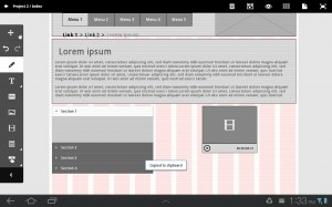
Adobe Proto. Once a color scheme has been created, one would then work with the client on the actual design of the site. Given that most sites are dynamic, one would need to include a few pages as samples for various parts of the user experience. The gestures based interface allows one to rapidly prototype a web page (or a series of pages). One can view them locally or upload to the Adobe Creative Cloud. As needed, you can share links to files in the Creative Cloud and seek feedback from others. One can also download a zip file from the Creative Cloud which can be opened and used immediately in Dreamweaver. One seems to have necessary starting assets and the materials are HTML5.
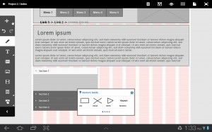
This is an initial view showing some of the allowed gestures in Proto.
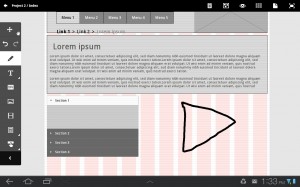
In the image below, you note that I draw a crude triangle. Actually it is hard to draw and do a screen capture at the same time.
The triangle I drew is immediately recognized by Proto and a video placeholder is inserted in place of my crude drawing. I could then re-size the resulting placeholder as needed.
So, I no longer need to take a pad of paper to an initial meeting with the client. I can work with them and seek immediate feedback. The results are something I can upload and access with an appropriate tool once I return to the office.
I envision using Photoshop Touch and Debut to review images and artwork with a client and annotate necessary changes jointly.
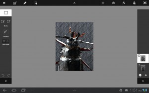
Adobe Photoshop Touch. I can modify an existing image and use multiple layers and filters for various effects. Here I have modified an image of a beetle making it look like a pencil sketch. This could be done working with a client directly. This is a screen capture as I was working in this tool.
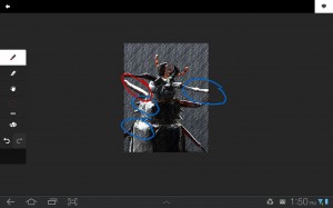
Adobe Debut. Lastly, one could also mark up images or vector art using this tool. One could even get customer “sign off” on the actual revisions. In this example, one would need to make corrections to those parts of the image which appear washed out.
The fact that one can work with the client and make round trips to actual applications to me is a huge time saver. It should also significantly reduce confusion and misinterpretation of what the client desires.
The big issue to me is how to best incorporate these new approaches into the materials I teach. It is doubtful everyone can afford a tablet at this time. However, students need to be aware of these increased capabilities and how they affect work flow.
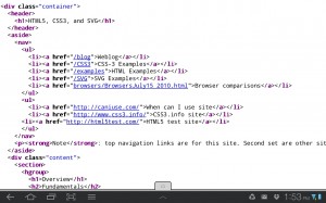
In addition to the above mentioned Adobe Touch Apps, one also needs some browser capabilities as a web designer. It appears Firefox has the greatest set of useful mobile plugins at this point in time. I installed the mobile tools and error console add-ons. For example, one can view the page source (in the event there is a problem). In the screen capture below, we see magnified parts of a page I created last year.
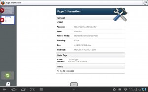
One can also view page information.
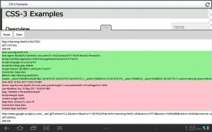
Additionally, one can see how long it takes for a request and response from the server.
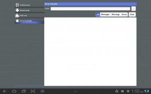
Lastly, one can work with an error console in the settings for Firefox.
Although this does not equal capabilities of a desktop environment, there are a number of features one can employ on a tablet to help with the basic design of a website. I see this as the ability to eliminate a fair amount of paper, increase understanding when meeting with a client and expedited workflows. I believe this is only the beginning of a significant transformation.
I look forward to your thoughts and comments in the space below. Due to past issues with spammers, I must approve all comments.



Another great post Mark. Tablets certainly bring a new dimension in creative design and consultation work. I don’t have access to the Touch apps yet, but I have noticed that tablets tend to bring people together in the meetings I’ve attended where tablets are used. Using a tablet with clients seems to be a lot more personable than using a laptop. It’s an very interesting dynamic. With the projected proliferation of tablets this is going to be a pretty exciting time to figure it all out. Glad you’re blogging about it! I’ll try to do the same.
Thanks for the kind words. I look forward to reading your posts as well. I am struggling mightily with how to best incorporate this into what we teach our students. I think they need to know and need to be comfortable with these approaches as they transition into business.
Best,
Mark
A great report Mark and thanks for the education on these tools. I’ve installed Adobe Creative Cloud. At least I think I have. ACC says it installed successfully but I can’t find any new client on my machine. I’ll read up on it and get it working.
I’m looking forward to trying out Proto when it ships. I’ve been using dropbox for collaboration and it’s not too bad but what is missing is a layer, a collaboration tool, that pushes updates out to all members in a structured way. I wonder if ACC has this built in? A neat scenario would be if a set of students/dev team/marketers/customers all began with a certain version and then as each member marks up an item then a storyboard is created where the team can then cherrypick the best solutions. Trying to remember and organize the best solutions always seems to be the challenge.
I think this is great – we have recently purchased an IPad2 as well as starting on Google Apps for email and other “cloud” based documentation. These suggestions will just invest me in my IPad further and concretes the fact to me, at least, that these tablets are becoming the future and the days of lugging your laptop to a meeting for any reason are becoming limited.
I really appreciated the detail that you provided in this article. It was very well done. I am curious, now that we are coming up on two years after it’s posting, are you still using any of the applications that you predicted would be beneficial to you in your web development? Do you utilize the tablet as much today as you thought might back then? Thanks for the info and I appreciate the feedback.
Adobe discontinued some of the apps mentioned (like Proto). However, I still use tablets for a fair amount of work. For example, I recently completed a small project using Photoshop Touch. These are great devices for quick content creation as well as content consumption. My views haven’t changed. If anything, I am more confident that tablets will be used more and more.
Best always,
Mark