Now that the semester is winding down, I wanted to spend some time experimenting with my Samsung Galaxy Tab 10.1 and Adobe Proto. To me this is a key tool to rapidly create wireframes. It is also something which I think needs to be incorporated into our web curricula. Therefore, I have decided to do several posts dealing with the fundamentals of using Adobe Proto. Arguably, this should be done in collaboration with the client.
For the first project, I thought it appropriate to tackle a simple form on a single page. BTW – this took me well under 20 minutes (including taking the screen captures). To me, this highlights why such a prototyping tool should be included in a web curriculum.
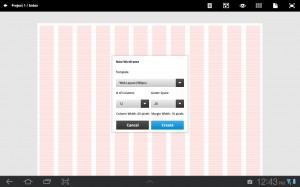
Step 1 – we need to create a new wireframe in Proto (we can touch the plus (+) icon in the bottom center of the application on the tablet to create a new wireframe. For the purposes of this document, I accepted the default values. A screen capture is below. As with all images, you can click on the image to enlarge it if you need to see more details.
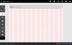
Step 2 – I consider it a “best practice” to surround my content with a <div> element. Therefore, I first created an upper division which contained sample breadcrumb navigation.
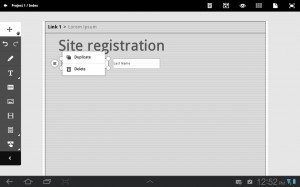
Step 3 – I next added a <div> to contain the form and included a heading [Hint: long tap on the lorem ipsum content to edit it and replace it with more meaningful text.] I also included a couple of initial fields on the form. You can easily duplicate a field once it is placed on the form by tapping on it and selecting “duplicate” from the = choices adjacent to the field.
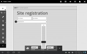
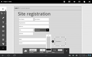
Step 4 – I began adding more fields for the form. Note that the text size may vary depending on the initial size of the input box. You can change the size of the text by selecting the object and modifying it as shown below.
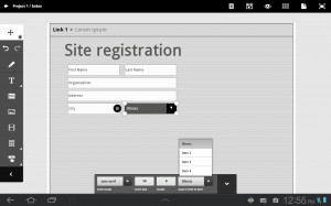
Step 5 – I next added a dropdown list and began modifying the contents (instead of the default Item 1, etc. I thought it best to actually list states for the hypothetical client). To modify the contents, you select the item and long tap on the contents. You can then edit it for the desired content.
Step 6 – I next added some checkboxes (you can control the number of boxes with a slider).
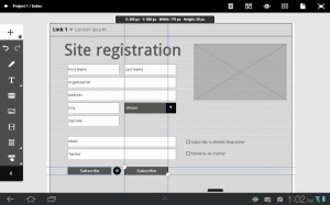
Step 7 – I completed the wireframe by adding a “logo” and submit and reset buttons (and aligned them with the default grid).
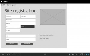
Step 8 – I next tried a preview in Proto. Obviously this is where a client would need to be heavily involved in the review and modifications to the wireframe.
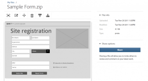
Step 9 – Lastly, I changed the default name to Sample Form and uploaded the wireframe to the Adobe Creative Cloud. I could then share the link with others and they could review and comment on the file.
Step 10 – I then downloaded the form, unzipped the files and began working on them in Dreamweaver. Once in Dreamweaver, I noticed several things. Obviously, the code is HTML5. However, the code does not validate initially. Most obviously, there is no <form> element encapsulating the form objects included in the wireframe. I also immediately noticed that the placeholder contents for each of the input form fields were included as value= attributes instead of the newer HTML5 placeholder= attribute. I also note that the CSS uses absolute positioning throughout. I do understand this is a wireframe and will need to be tweaked significantly by the web designer. However, the code is a reasonable starting point (and significantly beats doing this on a paper napkin and then trying to duplicate in code).
For those interested in examining the generated code from Proto, I provide this zip file. IT is exactly as downloaded from the Adobe Creative Cloud. I look forward to your comments as to whether this introductory tutorial helped you better understand the capabilities (and limitations of Proto).


I enjoyed reading this overview on Adobe Proto Thank you! Sounds like a great tool and a good starting point for the code. I can’t wait to try it out myself.