I have been examining the recently released Windows 8 Developer Preview. Obviously, my focus is on web development related materials. I was excited to see that JavaScript is included as a language choice with Visual Studio 2011. That will (hopefully) be the focus of another weblog entry in the near future). Today, I wanted to focus on my initial experiences with Internet Explorer 10.
Before getting started with the specifics, I think it important to note that Microsoft appears to be developing for emerging technologies and their associated human computer interactions. I suspect we will be seeing a lot of new hardware choices before Windows 8 is mainstream. The emphasis on Windows 8 is obviously mobile and multi-screen. This does not always seem to play well on a more traditional desktop/ laptop machine. Since I don’t have a recent Windows phone, the Metro interface is not as intuitive as I had hoped. I experienced a fair amount of fumbling until I “got it.” This was likely compounded by the fact that I was testing in a virtual environment on both desktop and laptop machines (none had a touch interface).
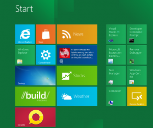
My initial plan was to download the .iso file and install using VMWare Player. Thanks to a couple of timely tweets, I saved myself a significant amount of grief. Apparently, there were initial problems with trying to launch that in VMWare (although many observed the new blue screen of death). Therefore, I chose both Oracle VirtualBox and Microsoft Hyper-V virtual environments. The install went smoothly in both. The initial screen is shown below. Obviously, I would then choose Internet Explorer from among the options. One can click on the image below to see a larger version. This is true for all the images below as well.
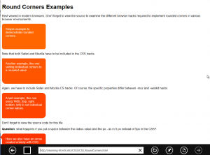
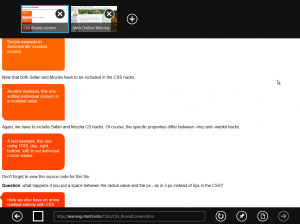
When I clicked on Internet Explorer, I immediately was taken to the Metro version (yes, there is also a desktop version). The Metro version has little browser chrome. One must move the cursor to the bottom (or right click) to open the interface. The image below shows the interface (including the address bar). One will note there are a limited number of choices (hopefully this will improve in the final version). I also note much better support for advanced CSS-3 (including rounded corners, shadows and so forth). I also noted that one does not need a vendor specific prefix (like -ms or -webkit) for most of the CSS-3 features to be recognized. Here is what a page looks like in the Metro view.
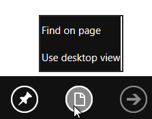
Ok, that is great – now, how do I view the source code? I know, only Mark would want to know that. Short answer is that you need to go to the more traditional desktop view. And, how do you get there, you might ask? Although not intuitive, one clicks on the second icon form the right on the bottom.
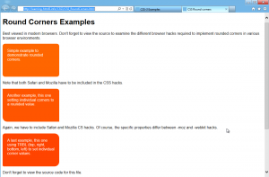
This activates the desktop view (which is another copy of Internet Explorer 10). Note that you can use the traditional Alt-Tab and Windows Key – Tab to switch between running applications. The desktop view has more traditional browser chrome and features such as view source and developer tools. That view of the same page is shown below.
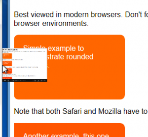
Ok, now, how do I go back (without using the Alt-Tab key combination). Turns out there is the ability to hover over the edge of the application and see the most recent application. This took a little getting used to (I suspect this is where the touch environment would come in very handy). Note the screen capture below.
Now that I am back in the Metro view, I might want to open a new tab. If one right clicks, more options appear. In this case, I already have two tabs open.
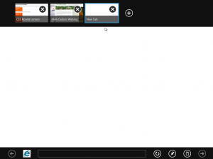
The tabs are similar to what one experiences in other platforms and their browsers (for example Android browsers). One can choose to add a new tab. This is where it does get a bit “interesting.” So, I asked for a new tab and received the following screen.
Note the back arrow in the upper left of the image above. Should I foolishly click on that (instead of selecting from the choices presented), I would get a white page. This makes sense as I did open a new tab and the tab would initially be blank. However, I need to examine the open tabs to realize this. In my opinion, this is a potential issue for those with cognitive memory impairments. In my simple mind, clicking on the back icon should close the new tab and take me back to the most recent tab I was using.
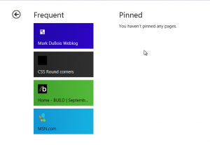
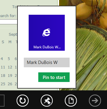
I also wanted to note that you can pin specific pages to the start menu. Note the pin icon above.
Now for overall initial impressions. The interface is somewhat intuitive (provided you have experience with smart phones or tablets). The lack of chrome in the Metro interface is a plus for those wishing to see more of the web page as an immersive experience/ app. The ability to see the page in a more traditional desktop view (along with necessary tools for a developer) is a plus. Of course, having this as a separate application will take up additional resources.
My biggest concern about the entire Windows 8 environment is that I see one could potentially lose work in progress. For example, one might have multiple tabs open in the Metro version. Perhaps one is in the middle of doing some research, filling out a form, checking weblogs, and so forth. Without right clicking, there are no visual clues that you have multiple tabs open. Therefore, one might forget to complete the rest of the form (or have it time out) before logging out. Perhaps the touch version addresses this concern. Overall, I do like the interface (and choices). However, it is a bit of a risk to diverge this far from more traditional Windows interfaces. Time will tell how risky this is.


I have only seen the presentation about windows 8. What I saw I was not a big fan of. I prefer the windows layout and not sure why they would want to phase out the PC like this. I have a smartphone but I don’t think I would like my PC desktop to be built the same way. I have used windows since 3.1. I don’t think its really necessary to have a smartphone layout, windows 7 is a huge success why attempt to deviate so much from it?
Also, I would like to hear more about cloud based computing. Is there more security risk opened up with users linked up to the cloud? (EG: The Playstation 3 cloud hacker who stole information from tens of thousands of users)
Cloud computing might be a great topic for a weblog. Yes, security is a bit issue. Unless you have a private cloud, you are turning control of your data over to someone else.
I look forward to that Mark 🙂
Metro and Windows 8 is a disaster!!
One moment you’re in metro, one second later back to “classical” and so on and so forth. The classic interface is crippled and the metro interface is limited. This is like 2 OS’s melted together on a Saturday night when devs were drunk.
I cannot tell anything different then it’s a disaster, a real disaster! Did I already say it’s a disaster? I hope I did, because it’s really terrible.
You raise some good points. Metro is a significant divergence from previous versions of Windows. It will be very interesting to see how this plays out with the general public once it is available for consumers. I do wonder about those who have been holding on to Windows XP (since end of life is rapidly approaching).
Best,
Mark
Windows 8 is great if all you want to do with your life is learn how to re-do the same things on a new version of Windows! In other words, it is a heap of crap. If you actually want to do something useful with a computer, you haven’t got time to re-learn such nonsense as how to turn a computer off. As for the “new look”, yes I understand that look may be useful for a mobile platform but it reminds me of the keyboard at the hospital from the movie, “Idiocracy”. (Just watch the movie!)
One of the biggest jokes over the years has been the so-called drive for “compatability” in computers. Then we have nonsense like having to re-learn how to do the most basic of tasks on each new version of Windows. I swear I’d be better off if you just gave me a memory map, a firmware guide and an assembler. At least then I’d be learning something useful. I’m desperately looking for a way to avoid Windows altogether. Maybe if they paid people a hundred grand to learn how to use each new version of windows … but even then, it’s still hours, days and weeks of my life that I will never get back.
P.S. I found this website while trying to find out how to “view source”, now my web explorer doesn’t have a “View > Source Code” drop down box anywhere in sight. Okay, in hindsight, maybe I should have tried right-clicking a bit sooner, I’ll keep that in mind. Meanwhile, I’m still trying to find out how to view an ogv or an flv video file. And why can I watch a video but not download it and then watch the download? I would just watch the video but it takes too long to download (keeps pausing), despite my so-called “up to 28Mbps” download speed. And also, now when I try to rewind, the computer automatically forgets everything it downloaded and starts downloading (at speeds as low as 3kbps) all over again. Internet videos really are becoming unwatchable. And given that I have to pay for everything I download, if I want to watch something twice, why would I want to download it twice? Why can’t I just save You-Tube videos straight to my hard drive?
Meanwhile I have to waste time learning such nonsense as “Bottom of right side of screen, settings, power, shut down” turns the computer off instead of “Start, shutdown”.
I feel your pain. Only time will tell if the new MS interface is useful or a waste of our valuable time.
Best,
Mark
It’s already wasted my time. It owes me. Big time.
😉